Tuesday, October 09, 2007

A New Method of Working + The Brothers Karamazov

Blue Pencil. I've used it before, but only when I would transfer my pencil drawing to bristol board by way of light table. I've never used it for actual drawing purposes, for whatever reason, most likely my own comfort with my materials. However, after this weekends FallCon, and seeing how other people work with blue pencil in their drawings, I decided to give it shot with the drawings below.


So, what's the big deal? These drawings are a lot cleaner than the drawings I've been doing for years. The trick? You can't even see the blue pencil, which I used for the under structure of the portraits. This way, when I finally put an HB pencil to paper, my line was more assured, and I knew what I wanted to do. And when I scanned the drawing, the blue pencil either didn't show up, or just barely. A quick Levels adjustment soon made it disappear.

And who are these characters, you may be asking? They are the Brothers Karamazov, from Dostoevsky's novel of the same name. From top to bottom, they are Dmitri, Ivan, and Alexei. I've been slowly reading the novel, in between my work for thesis and school, and I've just had such a vivid perception of the characters, that I felt now was a good opportunity to draw them. We'll see how they look once I ink them.

Sunday, October 07, 2007

FallCon Day 2

October 7-Fall Con Day 2. Just as hot and humid. *sigh* Oh well, a few more sketches came about.

The last of the Fantastic Four sketches. I really like how the Thing turned out, but I could never get a handle on Dr. Doom.

I've been thinking about a story where Tig and Rabbit, here in their early thirties, open up a coffee shop. I just drew out a quick scene, where Tig shows Rabbit a possible location, an old, abandoned diner. Rabbit isn't exactly pleased.
At MCAD, the Design department is doing a school wide theme entitled 'UFO.' I've decided to do something with teenage aliens, and these were some of my early sketches.
I'm not exactly a fan of this page, but this is where I ended my sketching. I decided to try and rework the design for Mary (from the wedding picture I did a couple posts earlier). The only drawing I'm really happy with is the three-quarter view at the top right, and looking at the original wedding picture, I'm not exactly sure why I thought her design needed to be improved.

FallCon Day 1

October 6-Fall Con Day 1! The weather was hot and humid, but I was able to do a good amount of sketching. I usually don't show my sketchbooks like this, but it might become a regular habit.
I'm not exactly keen on superheroes (my merch confirmed this), but this turned out to be a pretty superhero heavy con, so I gave in and did a bunch, mostly focused on the Fantastic Four. If I were to do a superhero comic, my choice would be Fantastic Four.
Of the Fantastic Four, though, I find Mr. Fantastic to be the most awkward. It's hard to make his power seem...'serious.' It can fall into comedy really fast. In light of this, I do find the top ink sketches to be fairly good. I made a first attempt at Dr. Doom at the bottom, and couldn't resist a Rabbit, Tigger, and Pooh sketch next to him.
The entire team!
I eventually broke away from the Four, and did a couple quick sketches of Dream and Death. I eventually made larger drawings of both of these, but I think I like the quick sketches better. The top sketch is of the emergency exit that was by my table.
This is probably the most awkward page. Basically, it's an array of hair styles, head shapes, and body parts that I caught over about a 10-15 minute period. Not much to look at, but some of you might find it interesting.

Sunday, September 30, 2007

Fall Con, St. Paul Minneosta! October 6 & 7!

This coming weekend, stop by the Minnesota State Fairgrounds for Fall Con! I'll be there along with hundreds of artists and dealers. Stop by to see and buy mini comics, posters, and a special fold out comic (from me anyway)!

What you need to know:
Fall Con, October 6 and 7 (Saturday and Sunday)
10 am to 5 pm (both days)
$10 admission fee
Where: Minnesota State Fairgrounds Education Building, St. Paul

For more information, click here: Midwest Comic Book Association

Hope to see you there!

Saturday, September 15, 2007

Illustration Friday-Wedding

Hello Illustration Friday, old friend! It's been awhile since a post, but I'm trying to get back into the swing of things.

So I thought I'd share a moment from the marriage of Mary Lockhart to Terrance 'Tig' Taggert, with Goldi as Maid of Honor and Eli Rabbit as Best Man.

(Okay, a bit of explanation: I have this thing where I take old cartoons, fairy tales, etc., and spin them into something new. So here we have Goldilocks, Mary (who had a little lamb), and Tigger and Rabbit from the Milne stories. I know, it's crazy, but it's easier to just go with it. Thanks!)

Friday, August 10, 2007

You Walk into a Comic Store...

Imagine, you walk into a bookstore, let's say a Barnes & Noble or Borders, just your run of the mill big box bookstore. You don't have anything in particular in mind to buy, you just want to browse, and if you're lucky, you'll leave with a book or two in hand. But as you walk through the store, you notice something odd. The genre titles have been removed, you don't know where fiction is from mystery or Civil War history. Instead, all you see signs are for the different publishers, Penguin-Putnam, Random House, etc. And any small press publishers are lumped into a general section called 'Independents.' You're confused, frustrated, and you leave the store disappointed and empty handed.

Welcome to the shopping experience of the modern day comic book reader.

As things stand today, based upon my experiences of going to comics stores in various cities across the country, this is how a comic book store will typically be divided, a system still set upon the precedent that Marvel and DC, along with Image and Dark Horse, are the dominant publishers, and everything else is lumped together without any organization or categorization except title or artist. In some cases, the books of the four publishers listed above will be shelved together, but this in some ways compounds the problem even more. A Dark Horse superhero title will be slightly different from a DC super hero title, and now the comics browser only has title to rely on.

So why am I pointing this out? This observation comes about from the search to another question; how do we as a comics community branch out to more people? And as shown above, it is clear that the experience of looking for comics is almost diametrically opposed to the experience of browsing for books. In a bookstore, if I'm looking for a science fiction title, I know where to look. If I'm looking for the latest Lewis Black book, I go check the Humor section. But what if I went to a comics store, and I wanted to find a romance title, or a book about paranormal investigators? Where would I go if I wanted to find the latest collection of 'Krazy Kat'? Here is where the dilemma enters the picture for those who haven't tested the waters of comics.

Let me be clear right now, I'm not throwing stones. I've never owned, run, or worked in a comic book store. Marvel and DC ARE the major players in the comic book market, and so comic store owners have to push their titles. And I believe comic book stores are the best ambassadors of the medium, more than any comic based movie or a convention can be. But is it in the interest of the comic community to expect people to conform to a different paradigm when looking for a book to read? If we really believe in the diversity of our medium, is there a better way for us to show it?

Wednesday, May 09, 2007

Figure in Perspective Final

So, this past semester I took the class 'Figure in Perspective' with Terry Beatty at the Minneapolis College of Art and Design. Overall, this is one of the best art classes I've taken, and it has had a dramatic effect on the way I work. Below are the final pages I did for the class; basically we were given scripts for one-page stories. The stories weren't too specific, so it allowed for a certain freedom of interpretation.This page was the crime story of the scripts, and of the three, is my favorite. Basically it's a reworking of Daredevil set in Victorian London, kinda like Batman in DC's 'Gotham by Gaslight.'
A romance page. Some good drawing came through, although a few trouble spots remain.

A gladiator page. I enjoyed drawing this, the villain's helmet is great, and like the romance page, some good drawing throughout. The biggest criticism though was that we can't see the weapons of the gladiators as they are about to strike, a criticism I tend to agree with.

Friday, April 20, 2007

Mid Program Selections!

So the school where I'm completing my grad studies, the Minneapolis College of Art and Design, has a mid program review after the first year (it's a two year program). It's a bit stressful and frantic, but you end up making some good work in the process. The next four posts feature the work I included in this review. Click on the image for a larger view. I hope it lives up to expectations!

'Rabbit's Routine'


A couple one page comics featuring Eli Rabbit.

'Saturn's Day'

A bit of an experiment for me, but one which I think shows promise for future endeavors.

'Mr. Humpty Dumpty.'


The first comic I completed for my grad studies. And to be honest, the one that started it all.

Humpty Dumpty in 'FIRED'


A follow up to 'Mr. Humpty Dumpty.' And once again, our old friend just can't get a break...

Monday, January 08, 2007

Mr. Humpty Dumpty Figurine


Say hello to Mr. Humpty Dumpty, the figurine!

I'll state first that I'm no sculptor, and probably never will be. But after a discussion with one of my graduate school colleagues, I decided to try something completely different, and create a figure of Humpty Dumpty from the comic I did, posted below. It's a bit rough, but I will admit, it was pretty fun, and something to keep in mind for future projects.

Batman: Fear Print

Believe it or not, this was a smaller project within my graduate studies from last semester. The initial drawing went through some changes digitally, so the print you see here is the final result, created using a photo polymer plate. I'm not sure what context it could be used in, since it would be hard to add a logo for a cover. Maybe a poster/pin up? It could also stand to have some color, so I'll post a new version when/if this happens.

Saturday, November 04, 2006

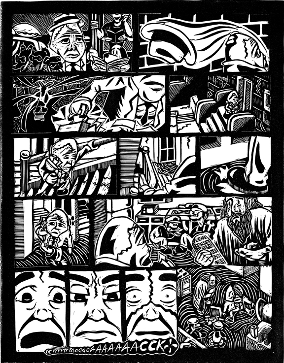
Mr. Humpty Dumpty


It's been a long absence, but hopefully it's been worthwhile as these images show. The first set is my first ever linocut comic. It's a pretty time consuming, intense process, so we'll see if I use it again (I'm looking at photo polymer as an alternative printing option for future comics). The set after is the same comic, but digitally colored. I was going to screenprint the colors, but due to technical issues, I set that aside for now. And besides, why should I be ashamed of the digital?