Imagine, you walk into a bookstore, let's say a Barnes & Noble or Borders, just your run of the mill big box bookstore. You don't have anything in particular in mind to buy, you just want to browse, and if you're lucky, you'll leave with a book or two in hand. But as you walk through the store, you notice something odd. The genre titles have been removed, you don't know where fiction is from mystery or Civil War history. Instead, all you see signs are for the different publishers, Penguin-Putnam, Random House, etc. And any small press publishers are lumped into a general section called 'Independents.' You're confused, frustrated, and you leave the store disappointed and empty handed.
Welcome to the shopping experience of the modern day comic book reader.
As things stand today, based upon my experiences of going to comics stores in various cities across the country, this is how a comic book store will typically be divided, a system still set upon the precedent that Marvel and DC, along with Image and Dark Horse, are the dominant publishers, and everything else is lumped together without any organization or categorization except title or artist. In some cases, the books of the four publishers listed above will be shelved together, but this in some ways compounds the problem even more. A Dark Horse superhero title will be slightly different from a DC super hero title, and now the comics browser only has title to rely on.
So why am I pointing this out? This observation comes about from the search to another question; how do we as a comics community branch out to more people? And as shown above, it is clear that the experience of looking for comics is almost diametrically opposed to the experience of browsing for books. In a bookstore, if I'm looking for a science fiction title, I know where to look. If I'm looking for the latest Lewis Black book, I go check the Humor section. But what if I went to a comics store, and I wanted to find a romance title, or a book about paranormal investigators? Where would I go if I wanted to find the latest collection of 'Krazy Kat'? Here is where the dilemma enters the picture for those who haven't tested the waters of comics.
Let me be clear right now, I'm not throwing stones. I've never owned, run, or worked in a comic book store. Marvel and DC ARE the major players in the comic book market, and so comic store owners have to push their titles. And I believe comic book stores are the best ambassadors of the medium, more than any comic based movie or a convention can be. But is it in the interest of the comic community to expect people to conform to a different paradigm when looking for a book to read? If we really believe in the diversity of our medium, is there a better way for us to show it?

Friday, August 10, 2007
Wednesday, May 09, 2007
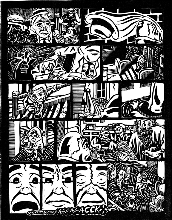
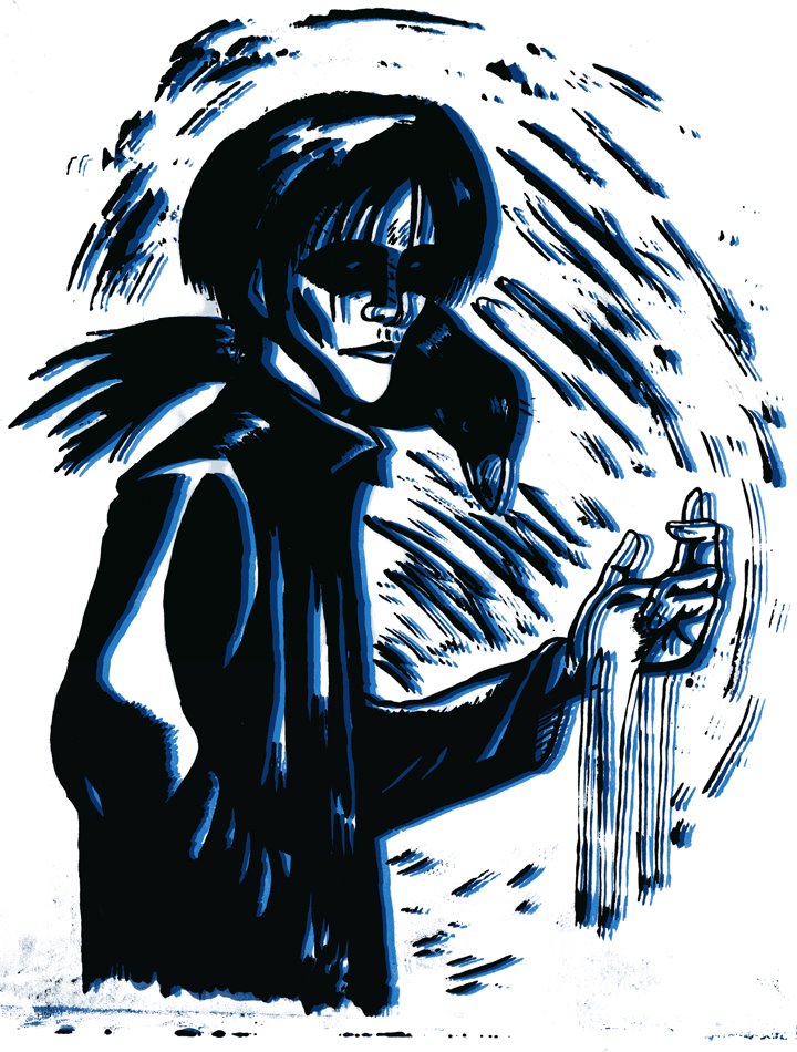
Figure in Perspective Final
So, this past semester I took the class 'Figure in Perspective' with Terry Beatty at the Minneapolis College of Art and Design. Overall, this is one of the best art classes I've taken, and it has had a dramatic effect on the way I work. Below are the final pages I did for the class; basically we were given scripts for one-page stories. The stories weren't too specific, so it allowed for a certain freedom of interpretation. This page was the crime story of the scripts, and of the three, is my favorite. Basically it's a reworking of Daredevil set in Victorian London, kinda like Batman in DC's 'Gotham by Gaslight.'
 A romance page. Some good drawing came through, although a few trouble spots remain.
 A gladiator page. I enjoyed drawing this, the villain's helmet is great, and like the romance page, some good drawing throughout. The biggest criticism though was that we can't see the weapons of the gladiators as they are about to strike, a criticism I tend to agree with.
 This page was the crime story of the scripts, and of the three, is my favorite. Basically it's a reworking of Daredevil set in Victorian London, kinda like Batman in DC's 'Gotham by Gaslight.'
 A romance page. Some good drawing came through, although a few trouble spots remain.
 A gladiator page. I enjoyed drawing this, the villain's helmet is great, and like the romance page, some good drawing throughout. The biggest criticism though was that we can't see the weapons of the gladiators as they are about to strike, a criticism I tend to agree with.
Friday, April 20, 2007
Mid Program Selections!
So the school where I'm completing my grad studies, the Minneapolis College of Art and Design, has a mid program review after the first year (it's a two year program). It's a bit stressful and frantic, but you end up making some good work in the process. The next four posts feature the work I included in this review. Click on the image for a larger view. I hope it lives up to expectations!


'Saturn's Day'
 A bit of an experiment for me, but one which I think shows promise for future endeavors.
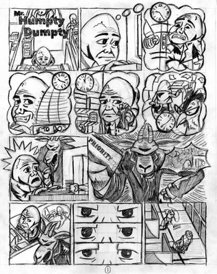
'Mr. Humpty Dumpty.'

 The first comic I completed for my grad studies. And to be honest, the one that started it all.
Humpty Dumpty in 'FIRED'

 A follow up to 'Mr. Humpty Dumpty.' And once again, our old friend just can't get a break...
Monday, January 08, 2007
Mr. Humpty Dumpty Figurine


 Say hello to Mr. Humpty Dumpty, the figurine!
I'll state first that I'm no sculptor, and probably never will be. But after a discussion with one of my graduate school colleagues, I decided to try something completely different, and create a figure of Humpty Dumpty from the comic I did, posted below. It's a bit rough, but I will admit, it was pretty fun, and something to keep in mind for future projects.
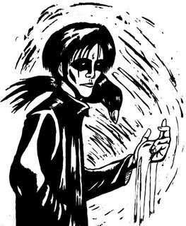
Batman: Fear Print
 Believe it or not, this was a smaller project within my graduate studies from last semester. The initial drawing went through some changes digitally, so the print you see here is the final result, created using a photo polymer plate. I'm not sure what context it could be used in, since it would be hard to add a logo for a cover. Maybe a poster/pin up? It could also stand to have some color, so I'll post a new version when/if this happens.
Saturday, November 04, 2006
Mr. Humpty Dumpty

It's been a long absence, but hopefully it's been worthwhile as these images show. The first set is my first ever linocut comic. It's a pretty time consuming, intense process, so we'll see if I use it again (I'm looking at photo polymer as an alternative printing option for future comics). The set after is the same comic, but digitally colored. I was going to screenprint the colors, but due to technical issues, I set that aside for now. And besides, why should I be ashamed of the digital?


Saturday, September 23, 2006
Graduate School-The Beginning
So, as many of you may already know, I have begun my graduate studies here at the Minneapolis College of Art and Design (MCAD for short). In between running around and dealing withe the bureaucracy here, I've begun to produce some work. This isn't stellar or grand, just some stuff to get my feet wet and prepare for the bigger projects downt the road. Here goes...
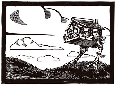
I wanted to get my feet wet with a quick, small relief print, so I did a depiction of the Russian witch Baba Yaga, and her walking chicken house. I had a little bit trouble printing this since I was using an unfamiliar press, so I'm not sure if I'll continue to use it with future blocks.
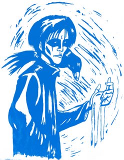
My first screenprint! Many may recognize this as the Sandman himself, Morpheus, Dream of the Endless (a popular subject for me). I'm not really 'taking' the class, but am sitting in on the occasional lecture and demo to see the process, and then going from there.

And finally (drumroll..........) the layout for my first linocut comic. Just two pages, and no real dialogue or captions, but a self contained story nonetheless, using my ideas from the 'Street Scenes' series. Hopefully, this will lead to good things (and hopefully a thesis).
So, not bad for a month's work, no?
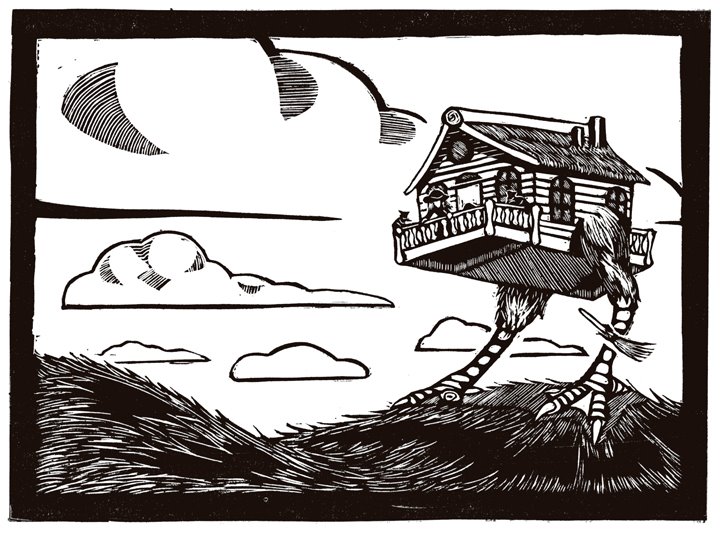
I wanted to get my feet wet with a quick, small relief print, so I did a depiction of the Russian witch Baba Yaga, and her walking chicken house. I had a little bit trouble printing this since I was using an unfamiliar press, so I'm not sure if I'll continue to use it with future blocks.


My first screenprint! Many may recognize this as the Sandman himself, Morpheus, Dream of the Endless (a popular subject for me). I'm not really 'taking' the class, but am sitting in on the occasional lecture and demo to see the process, and then going from there.


And finally (drumroll..........) the layout for my first linocut comic. Just two pages, and no real dialogue or captions, but a self contained story nonetheless, using my ideas from the 'Street Scenes' series. Hopefully, this will lead to good things (and hopefully a thesis).
So, not bad for a month's work, no?
Sunday, August 20, 2006
Illustration Friday-Match

I've seen a lot of creative uses for this weeks theme, so I hope mine can live up. Basically, I took two ideas, the literal match, and the 'matchmaker,' and combined them. I also dabbled with color on this one, which I typically don't do with my quick illustrations for IF.
The black line drawing was made with pen brushes, and then scanned to be colored with Photoshop, using the brush tool, and occasionally setting it to 'screen' and 'vivid light.'
Sunday, August 13, 2006
Illustration Friday-Play

Just a quck drawing for Illustration Friday, using characters from a previous post ('Mindy's Midnight Monsters)
And if you're a semi-regular visitor to this blog, you may have noticed that my profile has gone through some changes. I've been in Minneapolis for the past two weeks, and in another two weeks school starts. The gods only know what will happen after that.
Saturday, July 08, 2006
Skyline-Illustration Friday
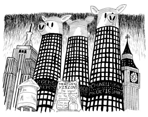


These three images go along with my Street Scenes series, and are pen and ink depictions of the city center that the series takes place in. A combination of old myths, fairy tales, and actual buildings that exist in our own 'world.'
The series itself is at a standstill. I've begun reading Bill Willingham's comic 'Fables' (published by DC/Vertigo), and it bears some resemblance to what I've been trying to do. Although there are quite a few things that are different; Willingham is a little more literal in his storytelling, while I'm trying to be a bit more symbolic. Once I get this conundrum worked out, I do intend on continuing the series.
Sunday, June 11, 2006
Proof of King Kong Engraving
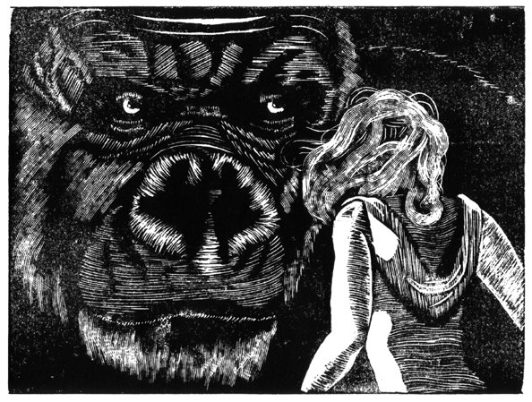
Loosely related to Illustration Friday's Jungle theme, this is a proof of an engraving I've been working on based on Peter Jackson's version of 'King Kong.' The engraving was done on a 6x8 Resingrave block. I apologize for the shoddy printing; I don't have direct access to a press, so I'm pulling prints by hand using two different types of barens.
Subscribe to:
Posts (Atom)